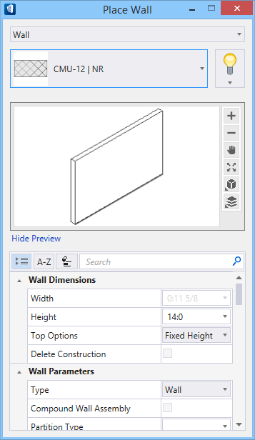
Place Wall
 Used to place linear, arc,
curve, and compound walls. Walls are defined by points which include the start
point and the end point. All wall types placed using this tool are supported by
the catalog library in the DataGroup System. Catalog data is applied to walls
at the time of placement. The
Place by options also allow creating walls from
space elements or placing a wall along a grid line.
Used to place linear, arc,
curve, and compound walls. Walls are defined by points which include the start
point and the end point. All wall types placed using this tool are supported by
the catalog library in the DataGroup System. Catalog data is applied to walls
at the time of placement. The
Place by options also allow creating walls from
space elements or placing a wall along a grid line.
Placement tab

| Setting | Description | ||||||||||||||||
|---|---|---|---|---|---|---|---|---|---|---|---|---|---|---|---|---|---|
| Place By |
|
||||||||||||||||
| Tolerance | Defines the smoothness of the wall curve by determining the number of segments that compose the curve. Decreasing the tolerance value creates more segments, resulting in a curve that is more smooth; increasing the tolerance value creates fewer segments, resulting in a curve that is less smooth. Enabled for the Curve wall placement option only. | ||||||||||||||||
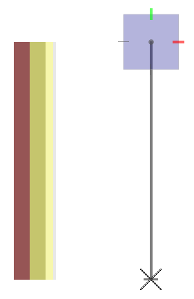
| Justify |
|
||||||||||||||||
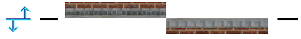
| Side Offset | Sets an offset distance and direction for wall
segments which is parallel to a line defined by two placement data points.
Direction can be set by using the
Left/Right option
menu; or by setting a negative distance for Left offset and a positive
distance for Right offset.
Tip: This setting is very useful when
snapping to column grid intersections during wall placement. Works in concert
with the Placement icons and the
Flip Wall option.
 Using grid intersection A-1 (position 1) as the start point, and using grid line A as the placement line, the wall is placed at an offset distance of 2 feet to position 2. The wall is placed in the negative X axis direction, using a Side Offset setting of -2:0. |
||||||||||||||||
| Direction | Sets the direction in which the wall is extruded. The sub-options are Left or Right. | ||||||||||||||||
| Base Offset | Sets the Z axis distance between the elevation of the active floor and the elevation of the item being placed (usually the bottom surface). BaseOffset can be a negative value. | ||||||||||||||||
 Offset Tilt Offset Tilt
|
Opens the Modify Form Direction tool which is used to change the default direction of the wall extrusion. | ||||||||||||||||
| Close Wall | When on, a Reset click adds a wall from the start point of the first wall to the end point of the last wall, to form an enclosed area. Enabled for the Linear wall placement option only. | ||||||||||||||||
| Auto Connect | Trims and cleans up wall intersections and wall ends during placement, when on. The utility recognizes wall intersection conditions with other walls, and with other components and elements such as square columns and grid lines. Enabled for the Linear and Arc wall placement options. | ||||||||||||||||
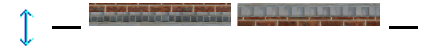
| Flip Wall | When on, wall segments flip to the opposite
orientation along the placement line (for the active placement mode) during
placement. Compound wall leaf’s also flip to opposite sides of the wall.
Enabled for the
Linear and
Arc wall placement options.
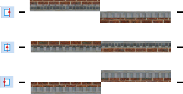 Walls segments on the left were placed with the Flip Wall setting off. Wall segments on the right were placed with the Flip Wall setting on.
|
 ) - Sets the wall type to
Linear. The wall is positioned by two
points: a start point and an end point.
) - Sets the wall type to
Linear. The wall is positioned by two
points: a start point and an end point.
 ) - Sets the wall type to
Arc - Start-Center-Edge. The wall is
positioned by three points: an endpoint, the arc center point, and a point that
defines the sweep angle.
) - Sets the wall type to
Arc - Start-Center-Edge. The wall is
positioned by three points: an endpoint, the arc center point, and a point that
defines the sweep angle.
 ) - Sets the wall type to
Arc - Start-Middle-Edge. The wall is
positioned by three points on the arc edge.
) - Sets the wall type to
Arc - Start-Middle-Edge. The wall is
positioned by three points on the arc edge.
 ) - Sets the wall type to
Curve, the Arc - Start-Middle-Edge.
Creates a segmented multi-radius curved wall, that can be composed of various
curves. The curves are controlled by data points placed at each curve's apex.
The smoothness of, or number of, segments comprising the curves is controlled
by the
) - Sets the wall type to
Curve, the Arc - Start-Middle-Edge.
Creates a segmented multi-radius curved wall, that can be composed of various
curves. The curves are controlled by data points placed at each curve's apex.
The smoothness of, or number of, segments comprising the curves is controlled
by the
 Left -
Places the wall to the top of the data point creation line.
Top in this case is relative to the
plan view orientation.
Left -
Places the wall to the top of the data point creation line.
Top in this case is relative to the
plan view orientation.
 Center - Places the wall
centered upon the data point creation line.
Center - Places the wall
centered upon the data point creation line.
 Right -
Places the wall to the bottom of the data point creation line.
Bottom in this case is relative to the
plan view orientation.
Right -
Places the wall to the bottom of the data point creation line.
Bottom in this case is relative to the
plan view orientation.


Wall Properties
| Setting | Description |
|---|---|
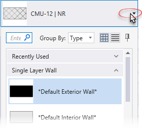
| Catalog Type Selector | Used to select from available Catalog Types. Selections made here updates the Catalog Item Selector combo box. |
| Catalog Item Selector |
Used to select from available
Catalog Items. The
Catalog Item Selector combo box contains
several options and settings designed to make it easier to find the exact
catalog item you need to place/change.
The
Catalog Item list also includes user
defined assemblies, and RFA catalog items, if any.
|
| Catalog Tools |
A split button located to the right of the
Catalog Item Selector contains tools to
assist with managing catalog data prior to placement of selected catalog items.
Note: The
Save Catalog Item and
Save Catalog Item As... tools perform
administrative tasks on DataGroup System catalogs. Administrators and users may
want to hide the tool icons to avoid incidental or unwanted changes to their
firm's dataset by setting the user configuration variables
BB_CATALOGITEM_ADMIN_IN_PLACECMDS
and
BB_CATALOGITEM_SAVEAS_IN_PLACECMDS to "0", respectively.
|
| Preview |
Displays the selected catalog item in the preview
window. This display changes and the preview updates as various options are
chosen. The preview also changes dynamically with some of the
prominent settings on the Placement tab, e.g Height, Rotation angle, etc. A
right-click in the Preview opens a
Show/Hide Viewing Tools option menu:
|
| Properties list - toolbar |
Used to manage catalog item properties during
placement or modification. Catalog item properties define the catalog item
instance in the model, and are accountable in the DataGroup System data
management tools. You can place a catalog item with its default property values
or you can change property values as needed, place an instance in the model,
and optionally save the changes to the catalog.
The Properties combo box contains tools for sorting and searching the properties list:
|
| Wall Dimensions | Properties that define the dimensions of the wall
being placed:
|
| Wall Parameters | Common wall properties that define the
characteristics of the wall being placed:
Note: Lists width
and height properties for wall catalog type items. These are set in the
Placement tab, and can not be modified
here.
|
| Structural Usage | Lists Structural usage properties. Structural function and material properties can be applied (if undefined) to active catalog items making them fully promoted Structural members. |
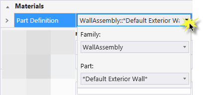
| Materials | Lists Part and Family definition assignments. Clicking in the Value column cell opens a Family and Part selection box. Here parts and families are available from the option menus. |
| Thermal Transmittance | Lists the thermal properties to apply to the active catalog item. |
| Identification | Lists identification properties for the active catalog item type. |
| Acoustical Parameters | Lists acoustical performance properties. The acoustic rating and test reference details are set here. |
| Fire Resistance | Lists fire rating properties based on agency fire safety tests and classifications. |
| Construction Phase | Lists design and construction phase properties for walls such as New Construction, Future Construction, and Items to be Moved. |
| Space Bounding | Lists properties that can be defined as On/Off making the selected catalog item eligible for consideration during energy analysis. |
| IFC Override | Lists IFC properties not automatically mapped to DataGroup System properties that can be manipulated for export. |
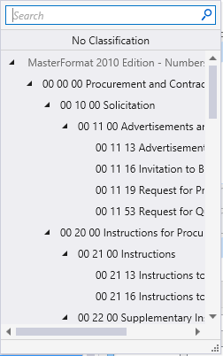
| Classification | Building Classification Systems are supported by the DataGroup System. MasterFormat, OmniClass, and UniFormat property values can be associated with any Building element. Click the Value cell to open the Classification System selection combo box. The combo box is populated with selected classification system property values. It can be resized by clicking on the combo box's bottom right corner. Search for properties by name. Search results are displayed in the classifications hierarchy. Double click a property to select it. This action also closes the selection menu. The selected property displays in the selected classification system property value (on the Properties list). |
 (
( (
( (
( (
( (
( (
( (
( (
( (
(


 (
( (
( (
(
Catalog selection with key-ins
Use the Catalog_Item argument to directly key-in the desired catalog item saved in the active DataGroup System catalog to pre-populate the tool settings. For instance TFPLACEMENT COMPONENT WALL Foundation(1'0" x 8" hi) + Wall (6" x 8"hi) where Foundation(1'0" x 8" hi) + Wall (6" x 8"hi) is the catalog item name.
Use the Catalog_Type and Catalog_Item arguments to key-in your user defined wall catalog items. For instance TFPLACEMENT COMPONENT USERWALL MyWalls "My Wall 001" where MyWalls is the catalog type and "My Wall 001" is the catalog item.